XR Watch
A streamlined VR menu interface to enhance productivity and learning

MY ROLE
UX Researcher, UI Designer, Software Developer
Figma, UI/UX, User-centric Design, Unreal Engine, Blender, Prototyping
TAGS
DESCIPRTION
The Smart Watch Menu is a VR interface designed to streamline interactions within the Smart Classroom, enhancing accessibility and productivity for students and educators. By integrating an intuitive wrist-worn menu, the project improves navigation, tool access, and collaboration in immersive learning environments.
PROJECT OBJECTIVES
> Enhance usability and efficiency by designing a wrist-mounted interface that allows users to access essential tools without disrupting their VR experience.
> Improve collaborative learning by enabling seamless media sharing, personalized settings, and interactive features that support student engagement.
DESIGN PROCESS

PROTOTYPING

STYLIZATION
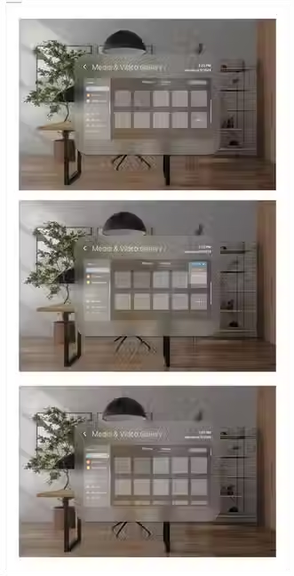
Based on our research into VR menu presentations, we opted for a glassmorphic aesthetic for this menu. Inspired by the Apple Vision, this design's subtle transparency effect is particularly beneficial in a VR context, enabling users to maintain visibility of both their wrist movements and the surrounding environment.
DESIGN SYSTEM

# Main Menu

# Advanced Audio
_edited.jpg)
# Notes


# File Upload

# Media & Video Gallery

# Camera

# Messages
HIGH-FIDELITY DESIGNS


TESTING + ITERATION
Overall, users found the interface visually appealing and easy to use, providing positive feedback on the user interface and visuals. The hover effect changing to blue was particularly well-received. While users quickly adapted to the UI and completed most tasks with ease, they also identified some areas for adjustments to enhance navigation and consistency.


OTHER PROJECTS
USER PERSONA
Based on our user surveys and affinity diagram, it became essential to identify the primary users of our product and thoroughly understand their needs and pain points. To achieve this, I analyzed our survey findings to capture nuanced insights and recurring patterns among participants.

KEY FINDINGS
By evaluating the data, we were able to determine which interactions and functions are most useful and should be prioritized for implementation. Additionally, we gained a clear understanding of user preferences for VR interactions. This helped us establish an ordered list of functionalities based on their importance and user desirability.


DISCOVER


